Artisans Asylum
Helping a Boston-based arts nonprofit organize their information architecture through an intuitive navigation menu, use accessible design elements, and properly showcase the magic and innovation they make possible.

Role
User Researcher, UX Designer, UI Copywriter, Branding.
Timeline
65 hours / 3 weeks

Constraints
Design must be simple enough to work on Squarespace (current service that the Client uses)
Site’s elements should not need daily updates and should be easy (for a novice) to maintain
Client does not want a logo redesign nor a full color rebrand
Problem
Outdated website
Confusing navigation
Inaccessible color choices and backgrounds
Business goals
Attract more paying monthly members
Convert those who take free classes into paying for more classes
Entice private donors to fund the org
Showcase their free/low cost offerings to the wider Boston community in order to qualify for grants from the city
Solution
Redesign the navigation menu so that it is intuitive and uses logical naming conventions
Make a homepage that captures the magic and innovation taking place at Artisans
Standardize design elements and branding across the site
Redesign 8 key pages throughout the website that present only the information that a user needs.
User interviews
Director of organization
1 Artisans member
3 Artisans member-volunteers
2 UX designers
Research Key Findings
1. Disorganized navigation menu
2. Misleading naming conventions
3. Too much information and obscuring of essential information
4. Outdated branding and inaccessible design choices
5. Lack of consistent patterns
Defining the problem
|
Defining the problem |
Card sorting
A card sorting exercise with three users helped me create a more intuitive sitemap, with renamed pages and categories.

How might we create a website that accurately represents the artistry and innovation that takes place at Artisans Asylum that will convert users into paying members?
Designing a solution
|
Designing a solution |
Low fidelity wireframes
I landed on a design that is blocky, modern, and minimalist.
Most importantly, it is modular (for ease of updating) and visually accessible.


Branding
ED1C24
9763F8
Since I couldn’t do a full rebrand, I paired the original red with purple to signify passion and energy as well as magic and innovation.
Design solutions
1. Navigation menu
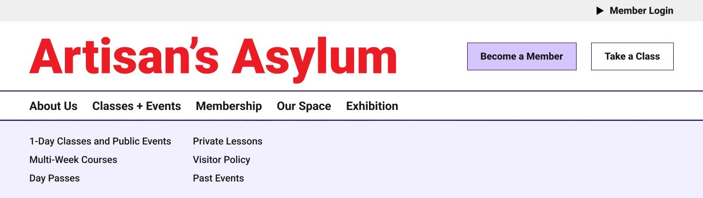
I redesigned the Artisans menu with prospective members in mind. Now, each page clearly belongs within the category it is listed within.
2. Naming conventions

The new Artisans navigation menu has recognizable page titles. I removed the confusing “Learn”, “Make”, and “Teach” categories.
Additionally, I removed all instances of the use of jargon or internal names to avoid confusing prospective members.
3. Displaying essential information

Membership costs and benefits are plainly laid out. The text previously displayed in the “Onboarding Instructions” section has been broken up into a skim-friendly FAQ.
4. Accessible design

I ensured all copy on the website is readable against the background colors. The updated Upcoming Events and Classes page features an easy-to-read calendar with filters, which will be easier for prospective class-takers to look through than the current Google calendar view on the site.
5. Repeatable template

This page for the Metal Workshop can be re-used for 21 of the 42 pages across the website. Using a repeating template will help reduce the cognitive load on a new user, who will remember where each piece of information can be typically found on a page.
Usability testing
|
Usability testing |
User tasks
Five users (three UX designers, two non-designers) were prompted to complete the following two tasks twice — once on the original live Artisans site and a second time on my redesigned interactive prototype.
Task 1: You want to sign up for a class with this organization. Please take me through the steps of finding a class that interests you.
Task 2: You want to become a member of this arts studio. Can you walk me through where you would look up pricing and learn more about the membership process?
Results
100% of participants (5 out of 5) were able to complete the following tasks:
Finding where to register for a class
Finding where to join the organization as a member
100% of participants (5 out of 5) were able to complete each task in under 40 seconds, compared to the 90-120 seconds it took them to complete the same tasks on the current Artisan’s Asylum website.
Conclusion
After iterating on minor errors found through usability testing, I presented my final high fidelity prototype to the Director of the organization in person.